Show Frequencies As
The cumulative frequency graph can show frequencies as absolute, relative or as percentages. For example, if we have 20 data points ranging from 5 to 15, the graph could look like:
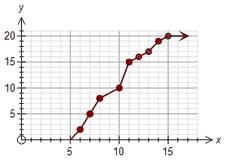
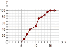
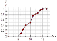
Absolute Percentage Relative
The only difference between the graphs is how the y axis is displayed.
Percentage frequencies and relative frequencies are most useful when comparing data sets which have different numbers of scores.
Use Class Centres As Scale (Grouped Data)
Some school systems require there students to construct the x axis scale so that the only marked numbers are the class centres for grouped data. This option will normally be turned off unless your school system requires this option.
AutoGroup Data
This option is normally selected.
If you draw a cumulative frequency graph for ungrouped data, it will appear "lumpy".
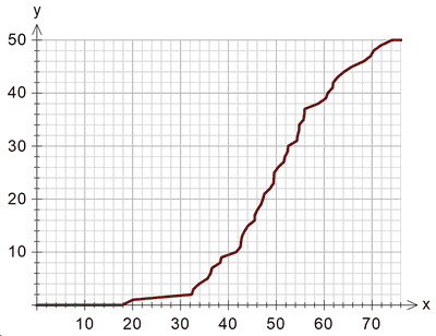
This is a "correct" representation of the cumulative data, but not normally what users are expecting. The autogroup option will automatically group the ungrouped data which produces something more like what users expect.
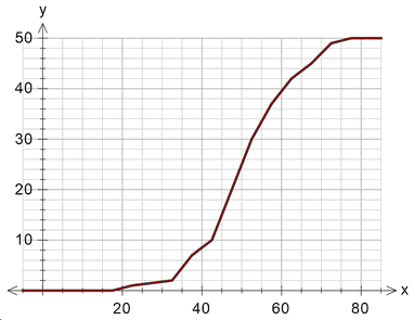
This is exactly the same data "autogrouped". Sometimes users want even more smoothing (rather than a graph constructed of line segments) which is a later option.
Autogrouping has no effect on data which is entered in groups.
Show Dots
You can choose to show a dot for each data point or to just show the line. Show dots is usually only useful for small number of data points.
If you use transparent shading for your data points, the colour of the shading of the dots indicates how many data points had that value.
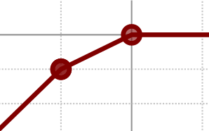
In the example, the point on the left was shaded twice (for two data points) and the point on the right has only been shaded once.
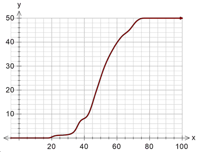
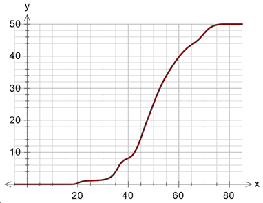
Smooth Curve for Grouped Data
This option smooths the curve rather than drawing it as line segments.
Show Median, LQ, UQ Lines

Show Arrow