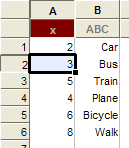
The stat tool can only draw one Pie/Divided Bar Graph at a time so the number of data boxes is reduced to one when drawing a pie graph.
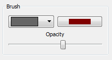
Display Type
Pie and divided bar graphs can be drawn with multiple colors or using a gradient based on the data box color.
Multiple Colors Color Gradient
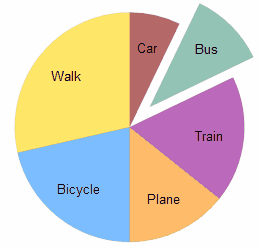
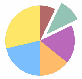
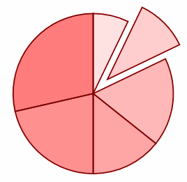
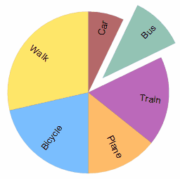
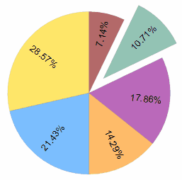
These examples show how Pie Graphs show highlighted data by exploding the sector out of the pie.
Color Gradient colors are automatically generated from the current data box color and the user has no control over the colors used (after picking the data box color).
Multiple Colors pie graphs give the user total control over the colors used in each segment. Right-clicking on a segment opens a segment color screen.
Labels
Pie and divided bar graphs automatically use any labels you have entered into your data.
The labels options allow you to add the raw data or the percentages to these labels. If there are no labels, the stat tool will just list the data or percentage.
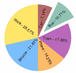
Labels and Percentages No Labels - Just Use Percentages
You can also turn off angled text