Frequency polygons do a similar job to histograms and share many of the same options.
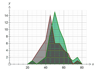
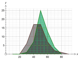
Standard frequency polygons (as opposed to stacked frequency polygons) show multiple data sets as overlayed polygons. Using the stat tool's transparency feature allows you to compare data sets.
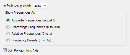
Default Group Width
This option only has an effect when you are graphing ungrouped data. If your data is already grouped, the stat tool will honour the groups you have set up.
If the Default Group Width is set to Auto, the stat tool will automatically decide how wide the groups should be when grouping your raw data. the stat tool will usually get it "right" but you can override the group width to produce the results you are after.
If you click on the Default Group Width, the stat tool will offer you a selection of standard group widths.
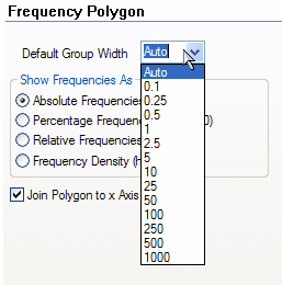
You are NOT limited to just these group widths. If you want to have a group width of 16.2, just type the value into the Default Group Width box and the stat tool will use your width to group the raw data.
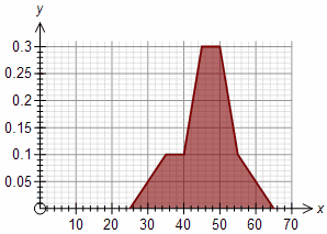
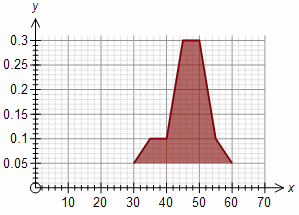
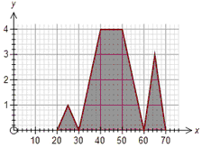
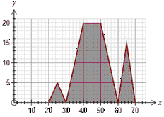
Group width = 5 Group width = 10
These two graphs show the same data graphed with two different group widths.
Show Frequencies As
The frequency polygon graph type can show frequencies as absolute, relative, percentages or as frequency densities. For example, if we have 20 data points ranging from 5 to 15, the graph could look like:
Absolute Percentage Relative
The only difference between the graphs is how the y axis is displayed.
Percentage frequencies and relative frequencies are most useful when comparing data sets which have different numbers of scores.
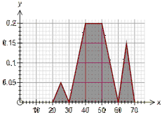
Frequency Densities
Frequency densities adjust the height of points on the polygon to allow for different widths in the groups. For example, if group A is twice as wide as group B but has the same number of data points, then the height of group A should be half that of group B.
When using frequency densities, the stat tool will calculate the height of the data point as
![]()
Join Polygon to Axis
Most frequency polygons are "attached" to the x axis by drawing a line from the first data point down to the x axis. Some schools of thought believe that this is inappropriate and only actual data should be drawn - which disconnects the polygon from the x axis.